CROSSROADS MUSIC FESTIVAL
Working with the Cricklewood Town Team in partnership with Crossroads Productions, I was tasked in creating a visual identity and promotional suite for a grassroots music festival celebrating Cricklewood’s cultural diversity. The materials needed to feel vibrant, inclusive, and adaptable across print, digital, and outdoor formats.
Composition, Typography, Hierarchy, Layout Principles, Pre-Press, Colour Management
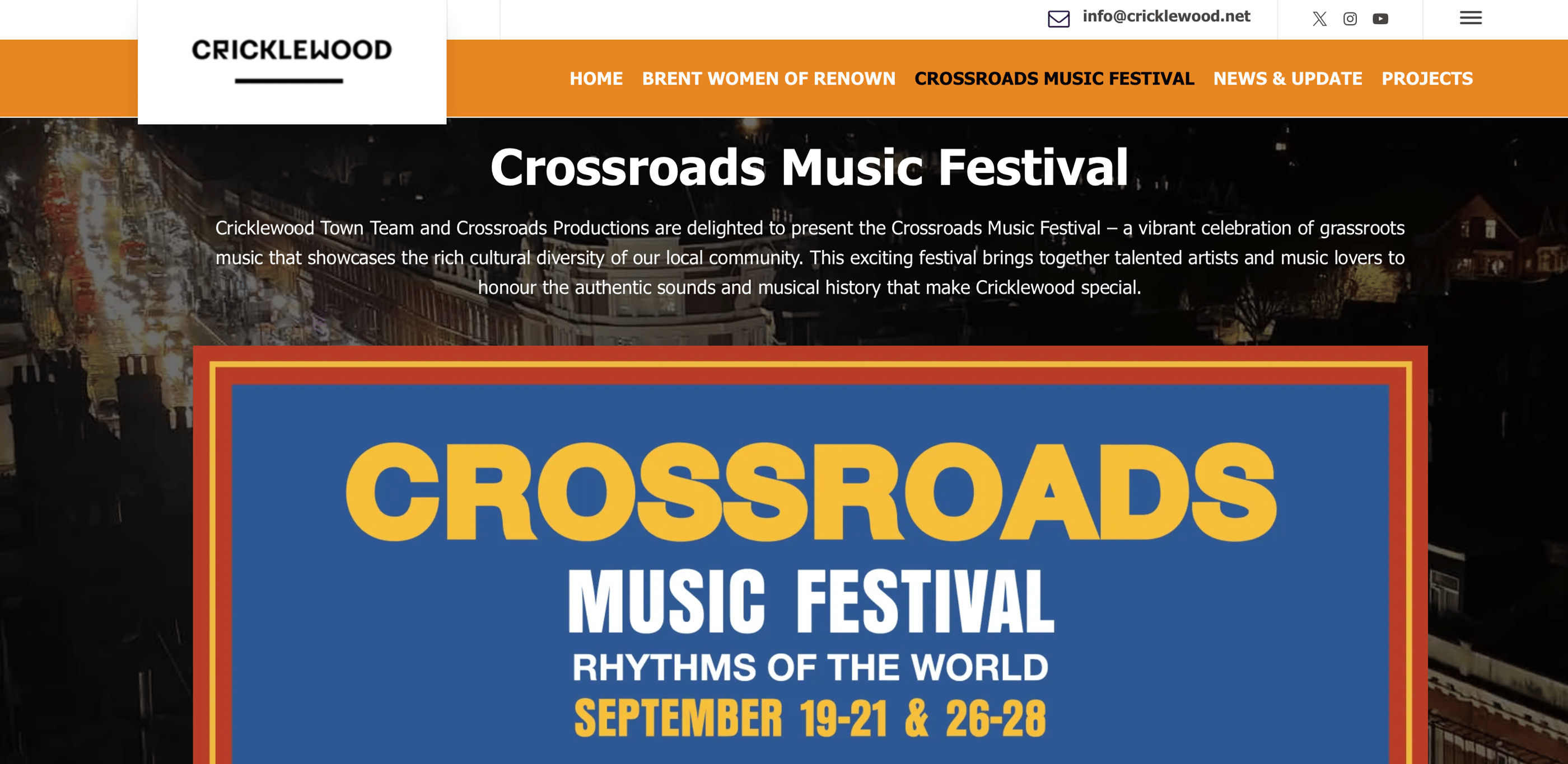
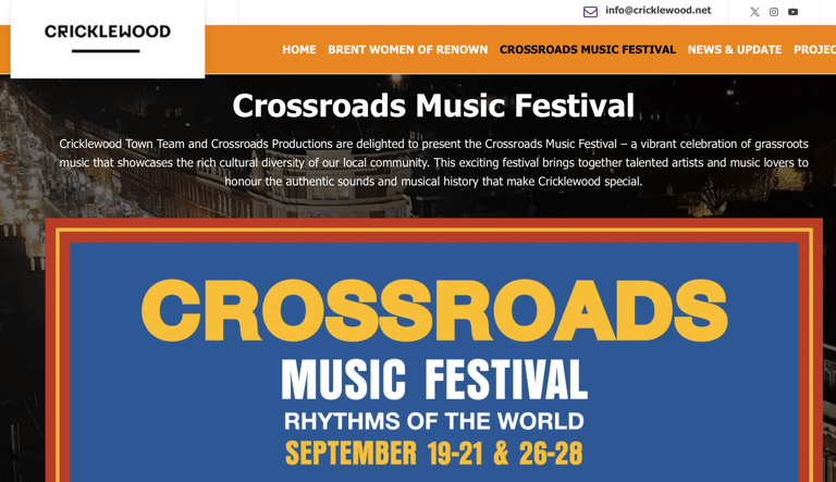
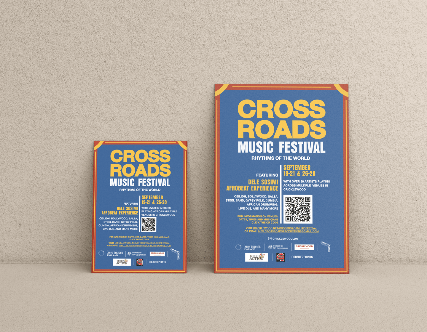
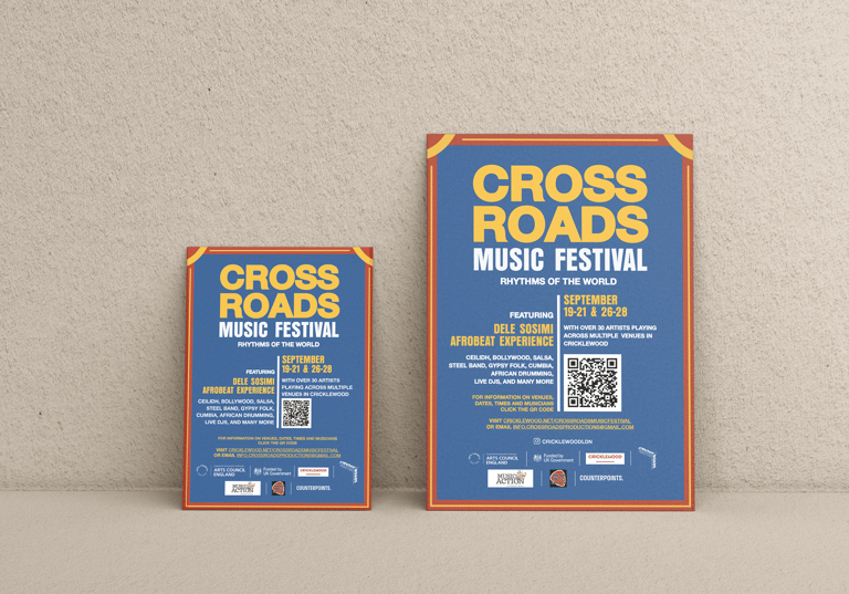
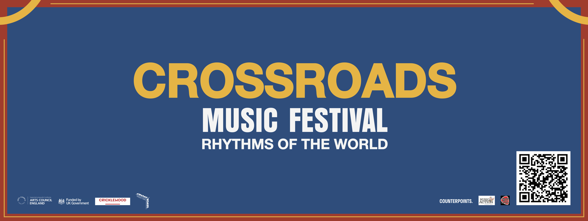
Project Summary: Designed for both print and digital formats, the posters use bold compositions, playful typography that echo musical rhythm and cultural layering. Adapted to various scales for outdoor and takeaway use, with simplified layout variations for high visibility in public spaces and community boards.
A clean, user friendly one page design that captured essential information (dates, venues, line-up, and maps) while visually tying in with the overall brand identity. All materials were unified through consistent use of the color palette and a typographic system that balanced energy with clarity.
The visuals were designed to reflect the grassroots, community driven nature of the event while also appealing to wider audiences, elevating the local festival to feel city-scale in ambition.
Design Concept: Inspired by themes of intersection and unity through diversity, the identity reflected Cricklewood’s multicultural character. A primary color palette, red, yellow and blue created a bold, universal visual language celebrating connection and community. These primary colors were chosen not only for their visual boldness and versatility but also for their symbolism:
Red reflects energy, rhythm, and cultural vibrancy
Yellow conveys warmth, openness, and community spirit
Blue evokes harmony, connection, and the open air settings of the event
Together, these colors form a visual language that is accessible, celebratory, and globally resonant, echoing the coming together of different heritages, musical genres, and audiences across Cricklewood.
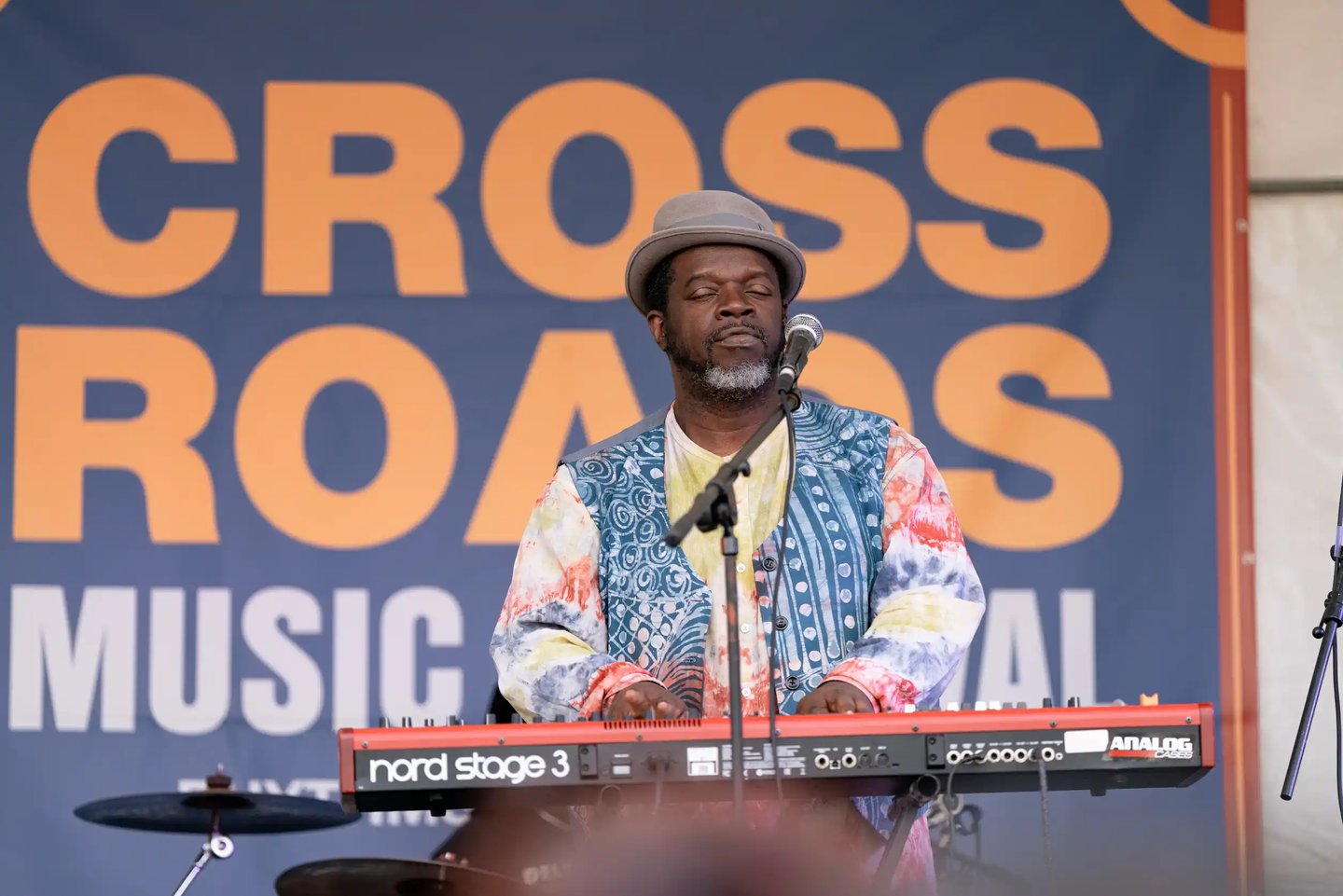
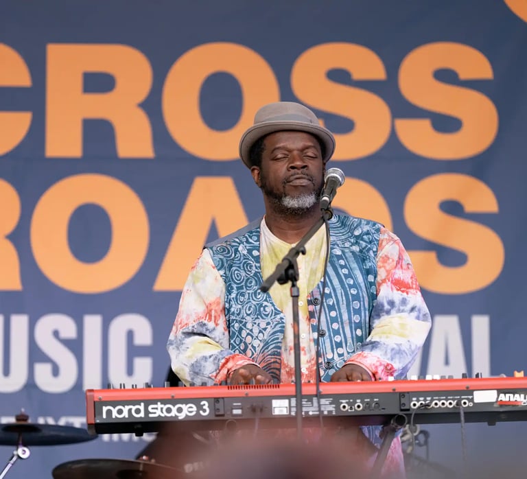
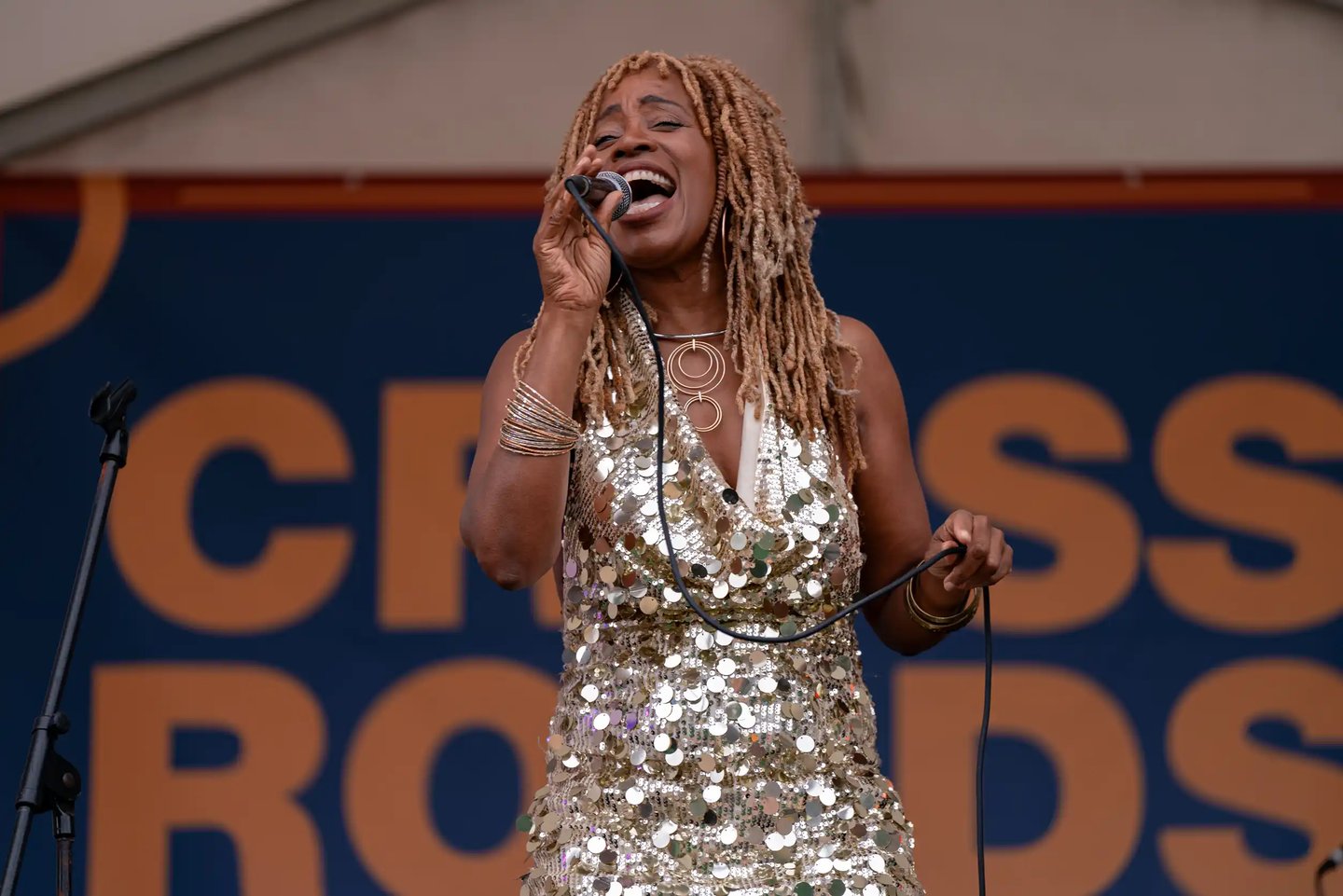
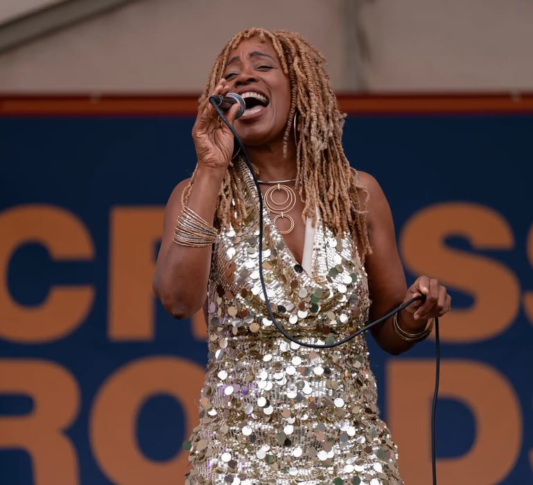
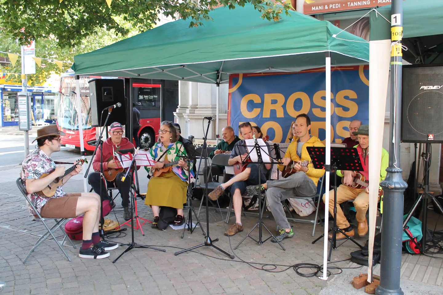
Photos from the festival by Paul Gilbey, Sabrina Parker, Gong studio